
Walter Sickert’s childhood was full of woodcut cartoons. It was a formative experience and for the rest of his life he regarded drawing and illustration as branches of the same activity.
InSight No. 179
Walter Sickert, Jack Ashore, c. 1912 / 13
Walter Sickert (1860–1942) was an exponent of what he called the ‘modern conversation-piece or genre picture’. Such pictures told stories without a source text, conjured from Sickert’s imagination and often involving a man and a woman arranged in a domestic setting. His storytelling began with drawing and, in 1922, he went so far as to assert: ‘The end of drawing must be supposed […] to be illustration.’ His viewpoint was partly formulated in response to Roger Fry’s insistence upon the autonomy and supreme importance of ‘form’. Yet the planks of Sickert’s outlook were established long before his one-time pupil’s damascene conversion to the cause of modern art. From an early stage in his life, Sickert regarded genre, drawing and illustration as interlocking concepts. Each served the same driving motivation: to tell stories. Without a story to tell, a drawing would be banal. Without the clarity and concision of illustration, the story would be poorly told. Evocative, caption-like titles were added, and much like the subtitles of illustrations in a novel or magazine, they crystallised the essential drama of the subject.

A child of the eighteen-sixties, Sickert was steeped in woodcut prints of periodicals such as Punch. Cartoons were a staple in the family home. His father Oswald Sickert made illustrations for the Fliegende Blätter in Munich and Walter later remembered the paper’s weekly arrival every Thursday night as ‘an event’. On another occasion, one of the Sickert children ‘in the absence of their father, entertained [the painter and President of the Royal Academy] Sir Frederic Burton by pointing out the parental woodcuts in bound copies of the Fliegende Blätter.’ At sixteen, Sickert was in his own words ‘saturated with the National Gallery and Charles Keene’, the latter being a celebrated draughtsman whose contributions appeared in the Illustrated London News, Punch and Once a Week. These experiences were formative to Sickert’s mature style of draughtsmanship, most especially his conversation pieces in which the precise use of a few lines could suggest not just the character of each figure but also the mood in a room.
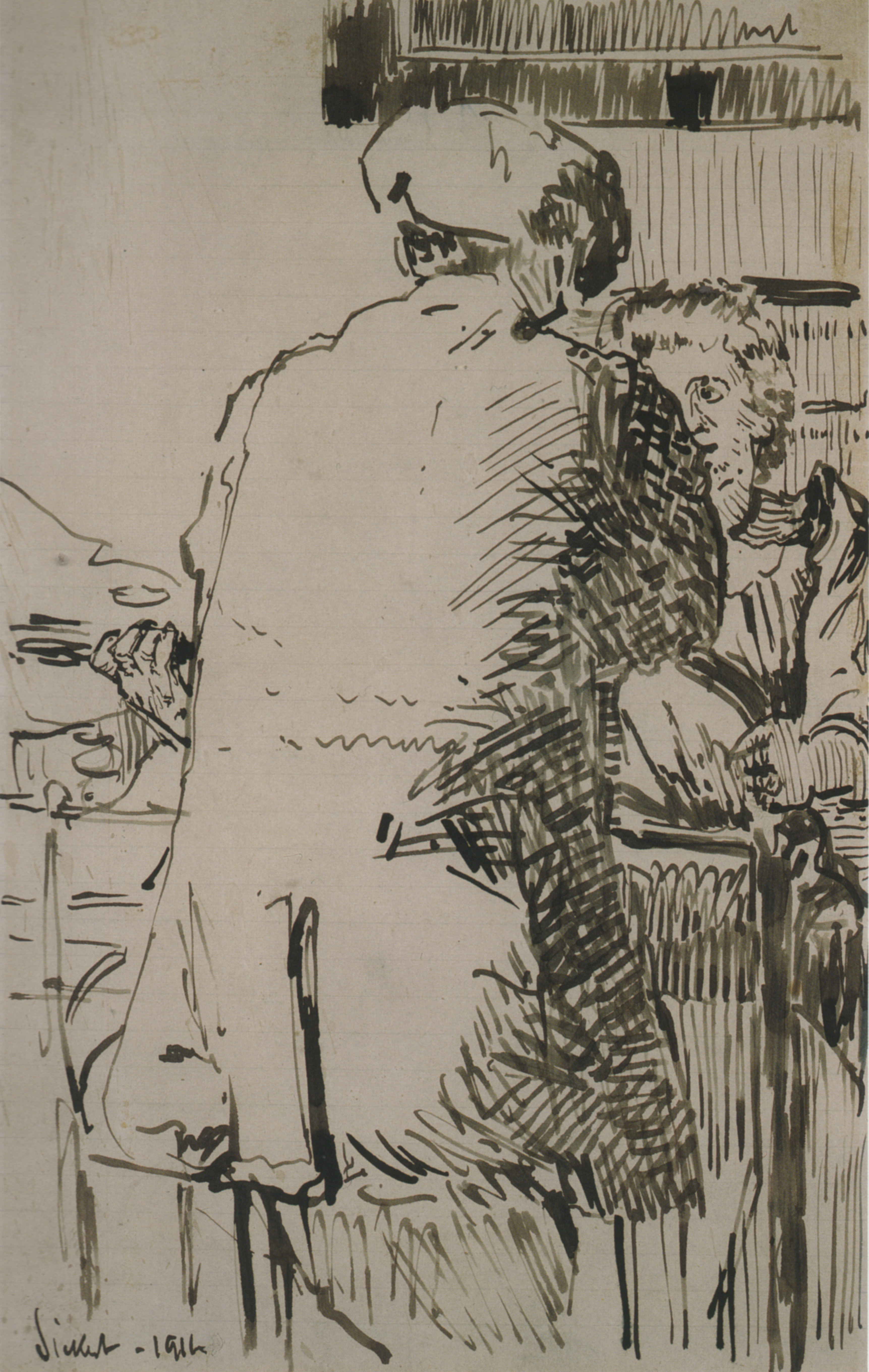
At various times between 1911 and 1914, Sickert found an outlet for drawing as illustration in a weekly journal called The New Age. His drawings were printed as stand-alone, full-page reproductions, and in 1914 he edited a series for the magazine called ‘Modern Drawings’, which included one drawing per issue by either himself or more often others in his circle such as Charles Ginner, Sylvia Gosse and Mary Godwin. Although he sometimes used drawings made years earlier, as with certain Venetian subjects, many of Sickert’s drawings illustrated in The New Age were made the same year as they were published and were perhaps intended specifically for that purpose. His favoured subjects at the time were the type of two-figure genre scenes that he was also painting. Titles were printed at the bottom of the page, beneath the reproduction, and they included Who Did You Say?, The Argument, Where Can It Be? and The Proposal. The issue released on 25 January 1912 included a drawing entitled A Conversation Piece, the heightened graphic style of which was facilitated by a quill pen.
In drawings for reproduction made between 1911 and 1914, Sickert used his pen to great and varied effect. Shading was produced by hatching scratched in with short strokes and little ink, or elaborated in systems of dense, richly inked lines. In areas of crosshatching, competing systems of lines entwine and overlap to describe both shadows and the shape of the forms. Details—of faces, clothing, furniture—are evoked by perfunctory accents, often dashed or dotted. Silhouettes are seldom drawn in continuous outlines but rather intimated by the relation of light and dark areas, the frontiers of which are precise yet insubstantial. As with Sickert’s paintings and prints, so too in his drawings, modelling often cuts across the forms rather than flowing along them.
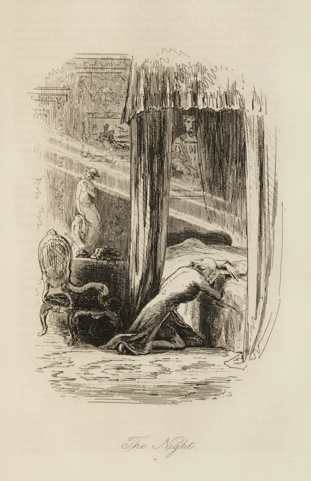
In many of Sickert’s drawings, ‘the preciousness of white spaces’ was allowed to flood the composition as an active ingredient of the design. Such works have the character of ‘a black pattern on a white ground’ (as opposed to the other kind: ‘drawings in which the excess of black pattern results, in effect, in a white pattern on a dark ground’). In 1915, Sickert formulated the following law: ‘Where an effect is obtained by placing black lines, patches, patterns or dots on a white ground, the pleasure of the observer begins to be lessened as soon as the amount of the black, being the pattern, tends to exceed the amount of the white, being the ground.’ Extended passages of untouched paper in Sickert’s own drawings made the lines of the drawing more legible and vivid. It was a lesson learned in the school of nineteenth-century illustration, and Sickert’s law was informed by the work of artists such as Hablot Knight Browne (or ‘Phiz’), who illustrated the novels of Charles Dickens. Notwithstanding its peculiarly modernist character, Sickert’s draughtsmanship shared with its revered precursors a common understanding of linear hatching, human drama, and the essential role of untouched paper.
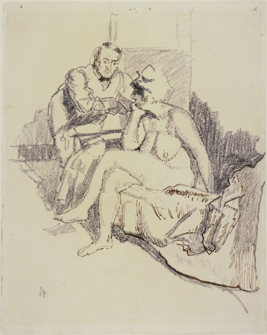
The drawings that Sickert intended for illustration in The New Age affected his other work of the same period, in which he often used pen and ink in concert with other graphic media. Wendy Baron has catalogued five drawings of the Jack Ashore subject, several of which use a pen technique similar to the New Age drawings. The Lucas Collection drawing of Jack Ashore, reproduced at the top of this email, is composed from two distinct phases of drawing. First, the design was drawn lightly and rapidly in charcoal. The soft, friable medium was used to create a substructure of shadows and mid tones. With pen and brown ink, Sickert proceeded to overlay the charcoal drawing with a mesh of accentuated dashes and extended areas of hatching, which variously emphasise local details and enhance the tonal substructure. Such concise pen-and-ink workmanship is indebted to his contemporaneous drawings for magazine illustration.

In this case as with many others, Sickert adopted the subject of his drawings for a further painting and two prints. Writing about Sickert’s soft-ground etching of Jack Ashore in 1922, John Middleton Murry observed: ‘Simply because the woman is so splendidly drawn, we know […] the precise accent with which “Dearie” trickles out of her lazy lips.’ As always for Sickert, the graphic qualities of a drawing were not motivated by a search for graphic qualities, but rather by the need to illuminate a subject that enchanted him. Such repetition—in five drawings, a painting, a soft-ground etching, a hard-ground etching—was partly a reflection of the artist’s keen interest in the subject, and his desire to illustrate it.

Images:
Oswald Sickert, ‘Die Klosterbibliothek’ in Fliegende Blätter, no. 258 (1850)
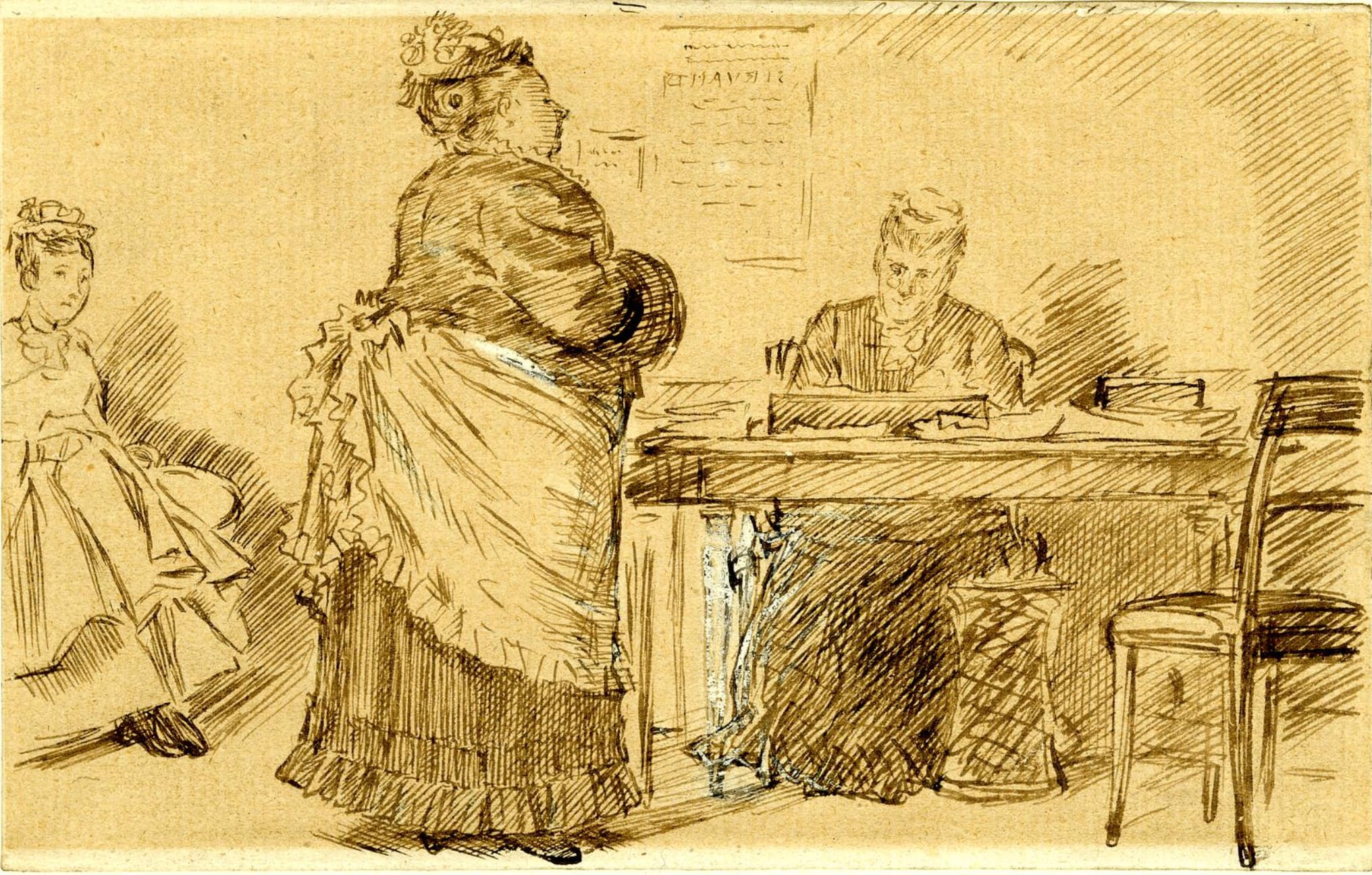
Charles Keene, Servants Agency, n.d., pen and ink with white heightening on paper,11.2 x 17.8 cm, British Museum, London
Walter Sickert, A Conversation Piece, 1911, pen and ink on lined paper, 32 x 19.7 cm, Auckland Art Gallery Toi o Tāmaki, New Zealand
Hablot Knight Browne ('Phiz'), illustration of The Night from Little Dorrit (1857) by Charles Dickens
Walter Sickert, Jack Ashore, c. 1912/13, crayon and ink on paper, 35.5 x 28.2 cm, Museum of Modern Art, New York
Walter Sickert, Jack Ashore (The Large Plate), c. 1912/13, soft-ground etching on paper, 45.5 x 34.5 cm (sheet)
Installation photograph of Sickert: Love, Death & Ennui at Piano Nobile, London

