
Orange is variously claimed to be the colour of joy, dance, unconditional love, health, power, vitality and, most literally, fire. For the artist William Scott, it was a source of painterly inspiration that lasted much of his career.
InSight No. 129
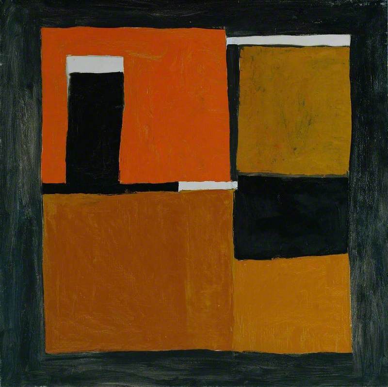
William Scott, Signs Orange and Ochre, 1962
William Scott (1913–1989) did not often use bright colours. When he did, cadmium orange was one of his favourites. In the new world of surfaces created by large format American abstract painting after the Second World War, imagery mattered less than palpable gestures and immersive pattern-making. Like many of his British peers, Scott made space to accommodate the logic of the new world with the old world of image making and represented objects. Beginning in the early fifties, he forged a method of depiction in which the material qualities of his subject were communicated by the body, handling and colour of paint. When orange occurred and recurred, it was not as surface decoration but as an intrinsic property of paint and of the thing represented in paint.
After Scott had ceased to work in a Picassoesque mode, an early and significant application of orange was made in 1953. In a manner redolent of Ben Nicholson’s contemporaneous table-top still lifes, Orange, Black and White Composition transfigured the table into a multifaceted surface of finely graded colour. The titular ‘orange’ is not singular – the interconnecting channels of black and white are structured around four hues ranging from cadmium to ochre.
Unlike Nicholson’s idealist tables, in which surfaces are transposed into textures that register the poignance of an ‘idea’, Scott’s tables were ready for the kitchen business of chopping, scrubbing, grating and eating. Humble kitchenware, principally ceramic pots and substantial frying pans with sturdy handles, were the focus of his attention. He considered these objects at length, and their round edges and enclosed basins of volume came to weigh upon the sinuous, irregular outlines of shape-objects that populate his still-life paintings.
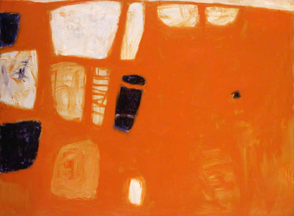
The enhanced role Scott afforded instinct in his work often meant that shapes and colours were freely interwoven as a painting developed. In a work like Orange and Blue, painted in 1957, the cadmium orange of the table’s surface was allowed to interact wet-on-wet with the silhouettes of white vessels. The result was an enhanced sense of the painting’s surface, with bowls on the table becoming a part of the table/canvas. As in Orange, Black and White Composition, the use of orange was piquant and helped to divorce Scott’s art from the dreary aspect of his self-consciously prosaic subject matter.
In the late fifties, Scott started scraping into the paint surface. Underlayers of contrasting colours were allowed to grin through to the surface, destabilising the sense of superficial solidity that he had created with still lifes such as Orange and Blue. Physical layering was accompanied by more sophisticated pictorial effects, with suggestions of depth and layered space being continually evoked and denied. The three dominant colours in Signs Orange and Ochre, painted in 1962, suggest three separate levels of depth: the pungent cadmium orange stands forwards from the neighbouring areas of ochre, and the areas of corrupted white at the lower edge appear as windows onto an area below or behind the surface.

The extended period through which Scott used cadmium orange shows that it held rich imaginative potential for him. This was not simply owing to its formal character. Amongst Scott’s papers, the art historian Sarah Whitfield discovered a British Museum postcard of a three-armed lamp made by the Nupe people. Its relation of colour and pattern suggest a connection with Signs Orange and Ochre, especially the decorative interlacing of white, yellow and black stripes. The warm hue of earthenware pottery can be considered at once a reference point and a source for Scott’s continued use of orange. Brown, ochre and orange recurred in Scott’s paintings until the late seventies, and this palette is one characteristic that helped to distinguish his art from the crowded field of post-war ‘abstract’ painting.

Images:
1. William Scott, Signs Orange and Ochre, 1962, oil on canvas, 183.2 x 122.3 cm
2. William Scott, Orange, Black and White Composition, 1953, Tate, London © Estate of William Scott
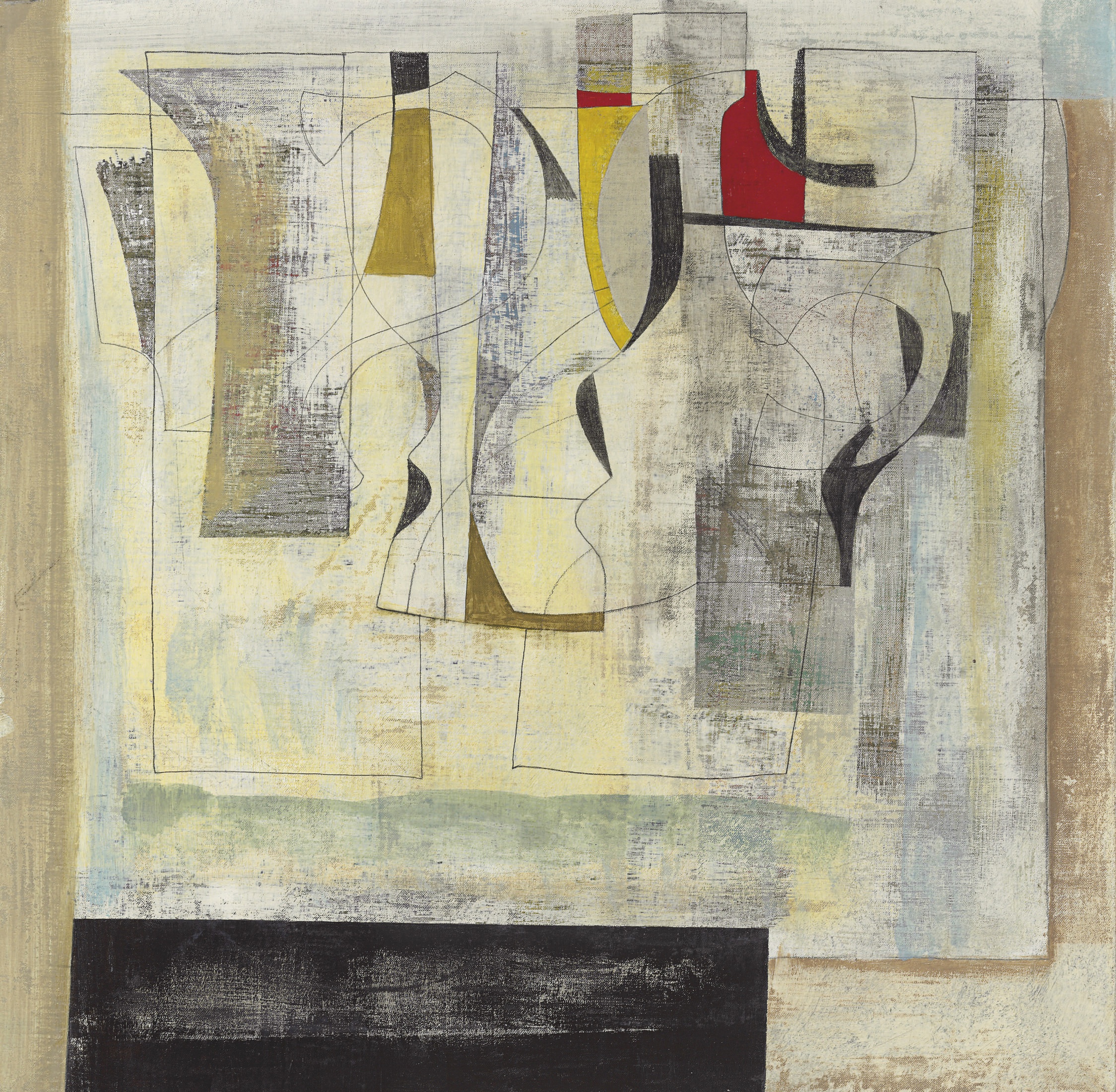
3. Ben Nicholson, May 55 (Pavane), 1955, Private Collection © Angela Verren Taunt
4. William Scott, Orange and Blue, 1957, British Council Collection © Estate of William Scott
5. Triple lamp made by the Nupe, 1860s, British Museum, London
6. Signs Orange and Ochre (detail)
