
Ben Nicholson’s rare use of lithographs reflected his friendship with pioneers of improved print and typography.
InSight No. 119
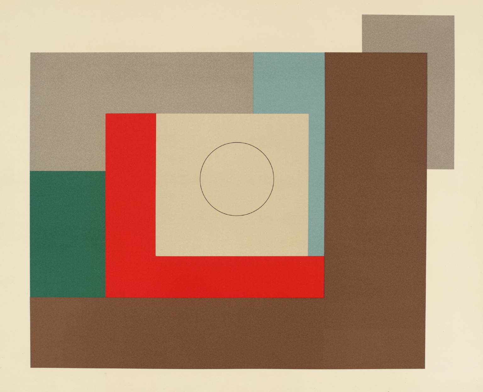
Ben Nicholson, squares & circles, 1939
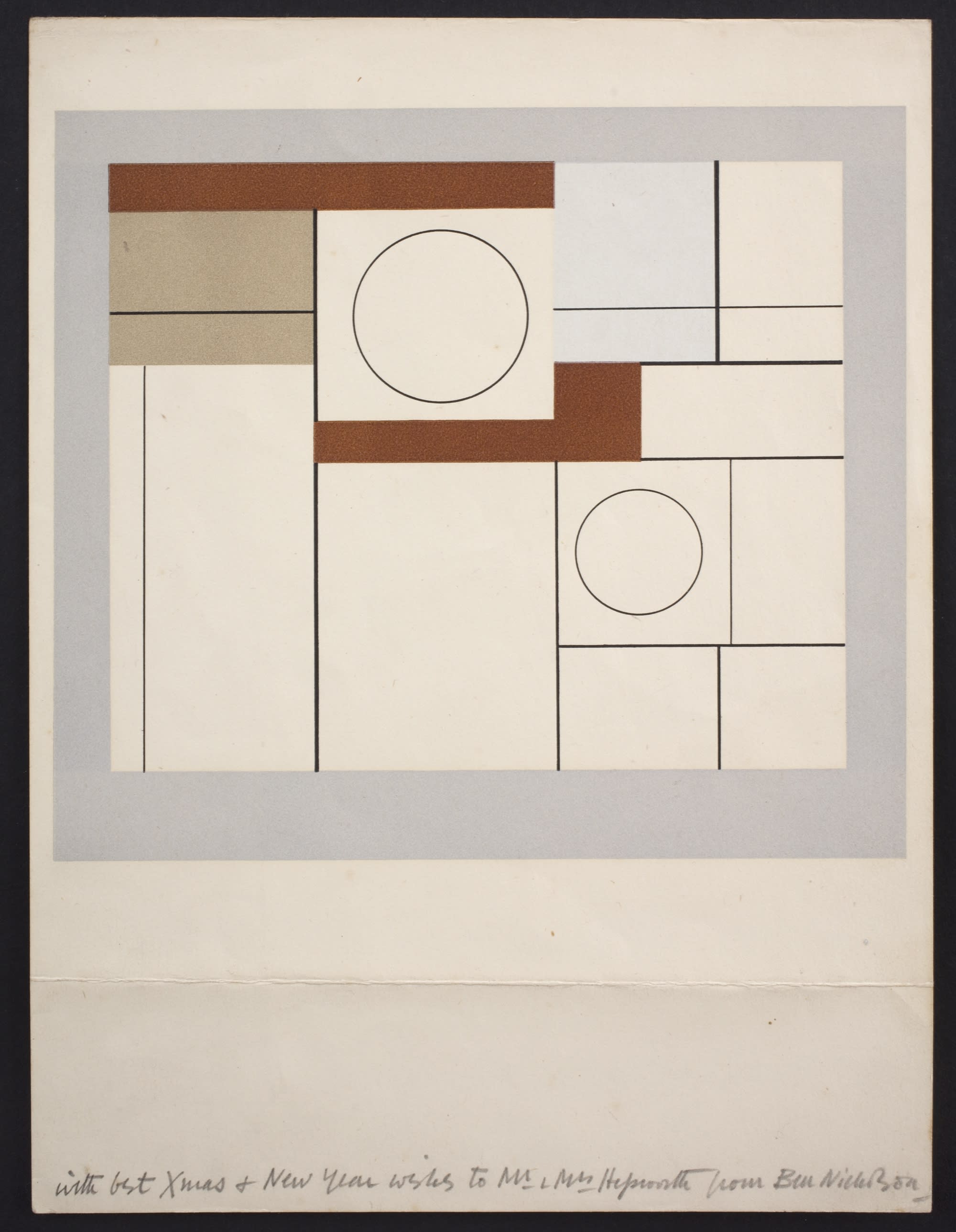
Lithography does not have the same cachet as other forms of printmaking: etchings and drypoints have the autographic quality of drawing, while relief printing (woodcuts especially) are capable of transferring the grain of one material to another. Yet in the twenties and thirties, it was brought alive by a small circle of design specialists and enthusiasts eager to disseminate the best of contemporary art through print and other mass media. Two works by Ben Nicholson (1894–1982) were reproduced as lithographs in the late 1930s – including a work known as “squares & circles” –with the assistance of his friend J.R.M. (Marcus) Brumwell.
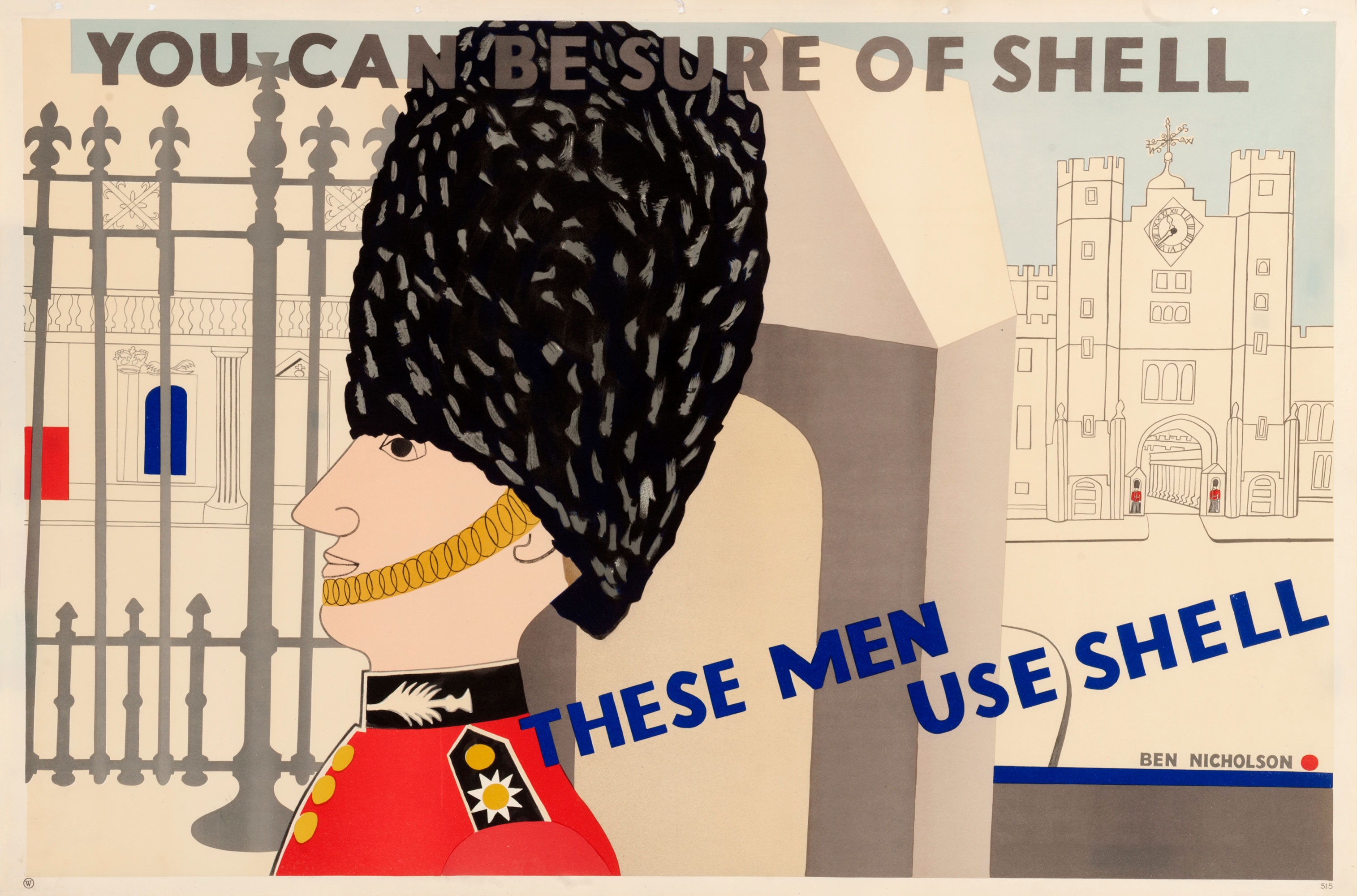
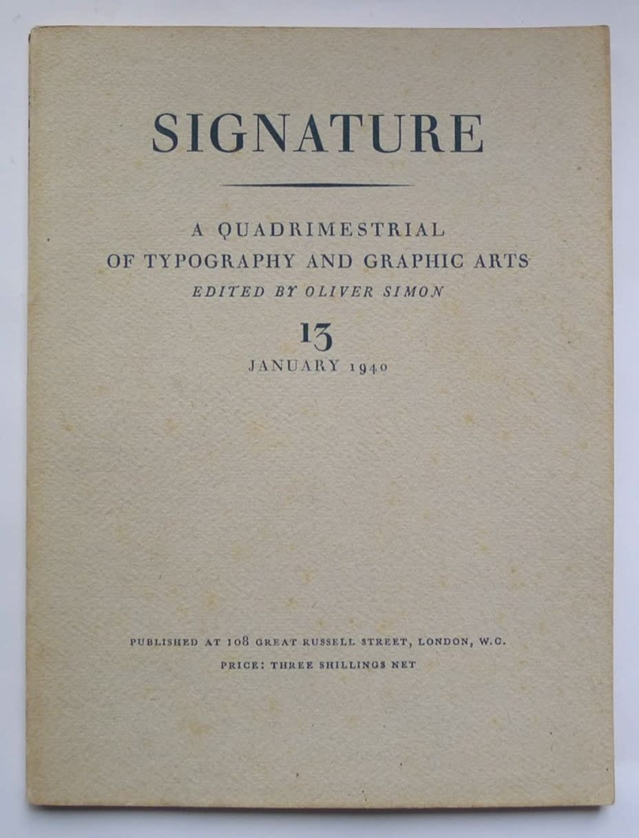
Brumwell began his career at Stuart Advertising Agency in the twenties. He became an executive there and in the later thirties was involved with facilitating Shell’s poster commissions including those by Nicholson and Paul Nash, the latter of which was prudishly redacted to preserve the Cerne Abbas Giant’s modesty. The quality of printed imagery was inextricable from that of font design, and Brumwell was connected with the printer Harold Curwen and Oliver Simon whose ‘quadrimestrial’ journal Signature brought together advanced art and typography in a considered, cleanly designed format. It was there that Nicholson’s offset lithograph squares & circles was printed in January 1940.
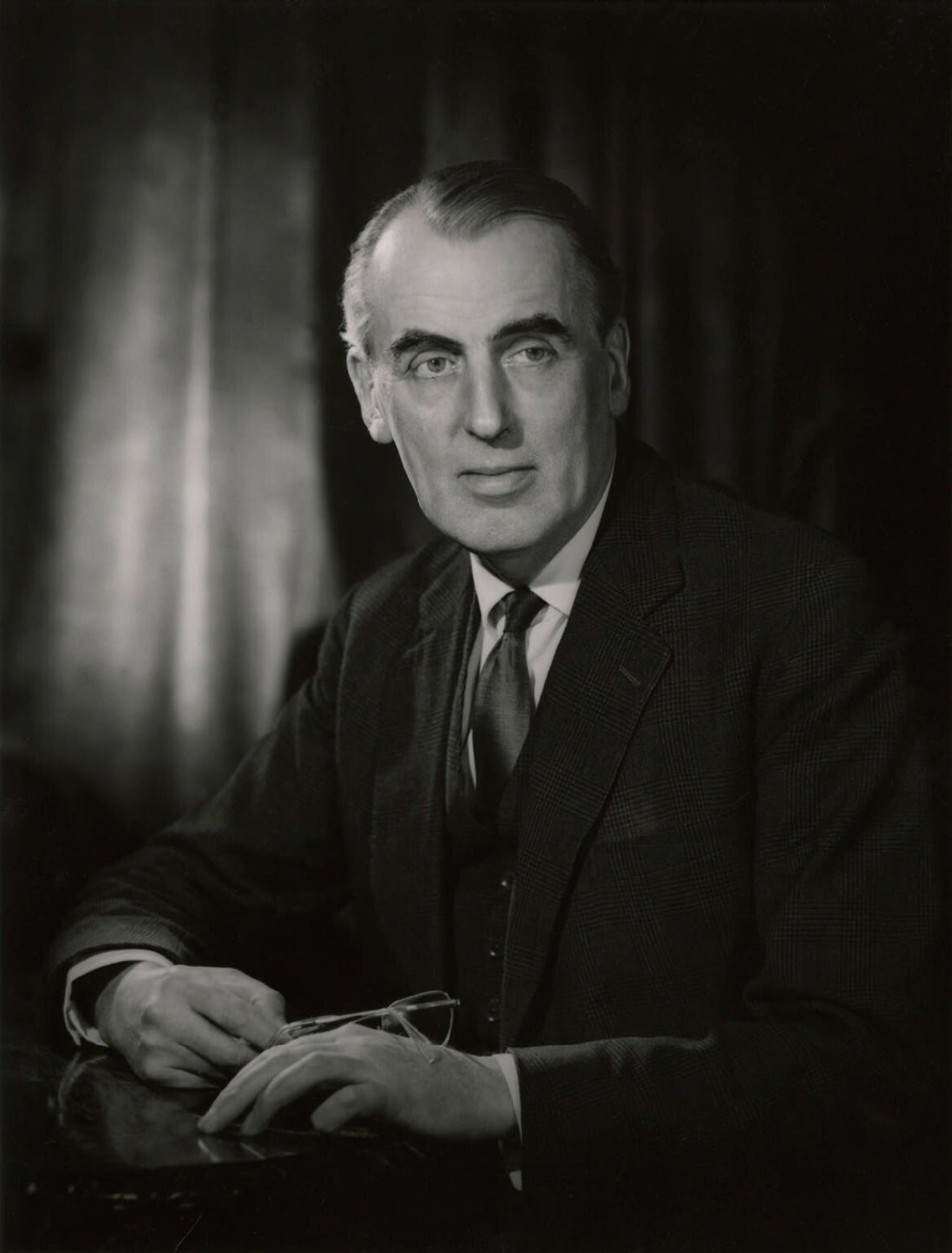
Shortly before it appeared in Signature, in December 1939 Nicholson had a number of impressions in his possession that he used as Christmas presents. Of the three impressions known to InSight, one is signed ‘BN–’ and two (including the work reproduced above) are inscribed from the artist to his relations. One was given to Barbara Hepworth’s parents Mr and Mrs Herbert Hepworth, and another to her sister Elizabeth and her husband the architectural historian John Summerson, who later wrote about Nicholson for the Penguin Modern Painters series. Nicholson’s use of the lithographs as presents suggests a degree of authorial satisfaction with their production.
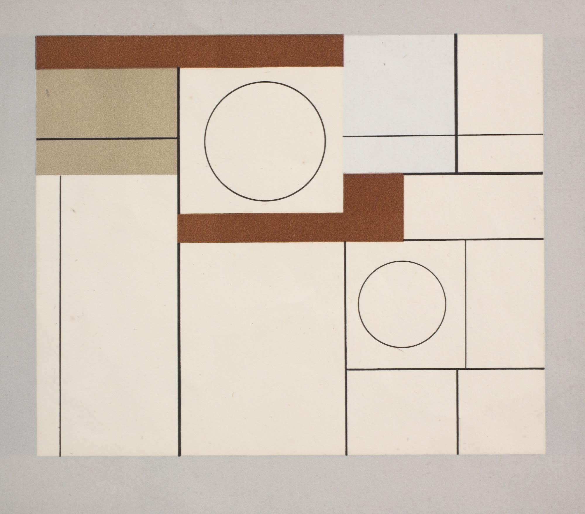
The other offset lithograph of Nicholson’s work, “abstract composition”, produced a few years earlier, was less felicitous. The issue was due in part to its size (it was just over twice as large as squares & circles). Although the print quality was good, having been produced by Curwen Press and Kingsway Reproduction (a trading name of Stuart Advertising Agency), Nicholson later wrote in 1964 that, ‘I thought it was made too large & therefore not convincing’. As with his autograph works, Nicholson showed a highly developed understanding for how to frame and present his art as a complete experience, encompassing both the art object at the centre and the mount or backing and the frame at the peripheries. Like the other inscribed examples, the print of squares & circles given to Mr and Mrs Hepworth had a fold at the lower edge; Nicholson unfolded this to reveal the margin, which extended the sheet downwards and changed its shape. A continuous band of dove grey around the outer edge of the print creates a parallel in the surroundings of the sheet, effectively animating the unprinted page as an extension of the complete object. This was then presented on a piece of black card, creating a stark contrast to the off-white paper and providing an additional layer of framing.
Considering Brumwell’s interest in improving print design and quality, it is unsurprising that squares & circles was reproduced from a work of Nicholson’s in his own collection. The work in question dates from a period when Nicholson was working almost exclusively in an abstract idiom. Other works from the late thirties such as Painted Relief show him using a narrow range of colour – predominantly white, grey and brown with local areas of bright red or yellow – with a geometrical, constructivist language almost entirely shorn of texture or imitative reference. His emphasis was upon the integrity and cohesion of each formal unit, though allusions to table tops, cups viewed from above or even the moon continue to underpin this personally distinctive mode.
Nicholson was always at pains to emphasise the lengthy process by which he came to make non-representational art. Writing to John Summerson on New Year’s Day in 1954, he referred to ‘the process of natural development into “abstract” work as opposed to popping a few squares and triangles onto a canvas’. After the war he was privately critical of younger contemporaries, many of whom became ‘abstract artists’ overnight: ‘so much of the abstract work being done today seems to me quite unreal.’ In the lithograph squares & circles, Nicholson showed the alert approach and allusive formality that distinguished his art and made it ‘real’.
Images:
1. Ben Nicholson, squares & circles, 1939, offset lithograph on paper, 15.7 x 17.5 cm (image)
2. Ben Nicholson, These Men Use Shell, 1938, National Motor Museum, Beaulieu © Angela Verren Taunt
3. The typography journal Signature
4. Sir John Summerson, photographed by Walter Bird, 1966, National Portrait Gallery © National Portrait Gallery, London
5. Ben Nicholson, abstract composition, 1936, lithograph, Tate Collection © Angela Verren Taunt
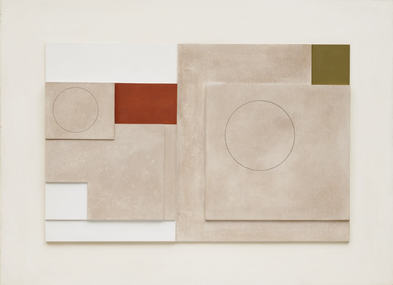
6. Ben Nicholson, Painted Relief, 1939, Museum of Modern Art, New York © Angela Verren Taunt
7. squares & circles (detail)
